MMS Car Rental
Project start date
2020-05-10
Duration
70 days
Project status
Completed
Work
Strategy, UX research, UX design, UI design, Framendi, Bakendi, integrations.
People involved
5 people - UX/UI designer, Framendi developer, Bakendi developer, Project manager, Copywriter
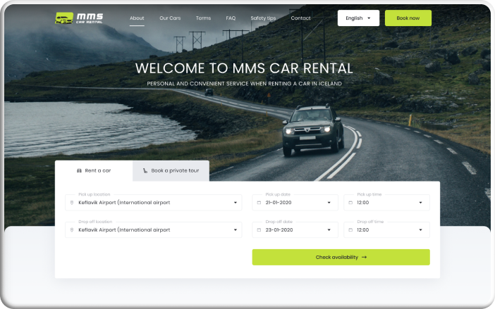
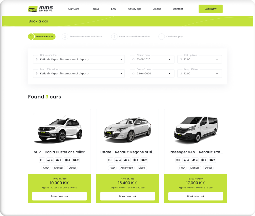
We have been approached by a client who was starting a car rental business based in Hveragerði, Iceland (appx. 45 km east of Reykjavik) and inquired us to build a robust and easy-to-use booking platform from both, customer and administrator standpoint. Given the fact, there are plenty of exemplary platforms made already, the brainstorming and planning went by effortlessly. Continuous communication led to faster requirements gathering and translation into use cases, followed by implementation. Site visitors can now perform the intended functions such as book a vehicle for desired period of time, pay for the booking(operated by a third party payment service) as well as reserve group transfers between the three main destinations. The project was completed within 3 months with the development team of 5 people working both, full-time and part-time distributed over two time zones . With scalability in mind, the platform can further be replicated to host another rental service.
See live project
Payment integration
For effortless payments, a local third party payment processor has been chosen. The services communicated via designated API endpoints to transfer necessary data securely and reliably.

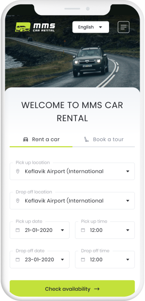
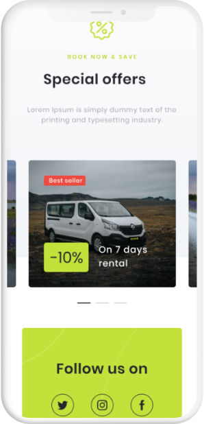
Mobile ready
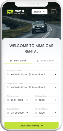
Smooth and responsive access to the website on the go. Whether on mobile or tablet, the user is presented the same experience as if they are browsing on computer or laptop.

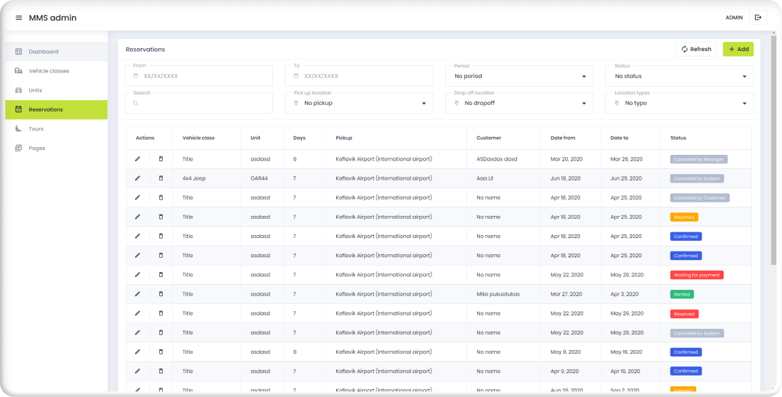
Custom admin dashboard
Minimalistic, but complete admin side enables to manage bookings, change rental durations, information about customers, trips, pickup/drop off locations, pricing models and more.

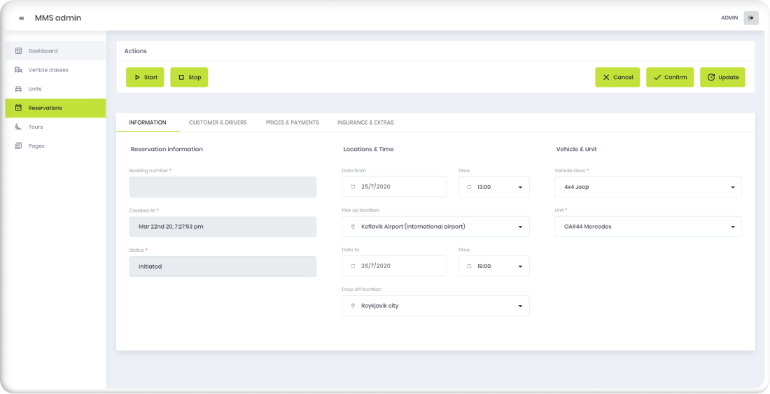
Fully customizable
Admin interface is built with customization in mind, thus it can easily be adapted to user’s requirements.

Automatic emails
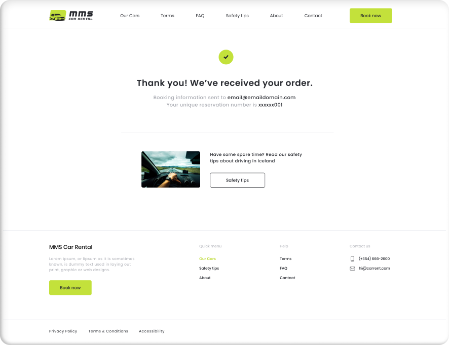
Reservation confirmations are automatically sent to the customer as soon as the booking is complete.

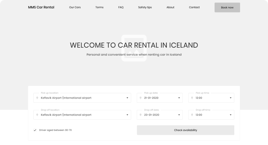
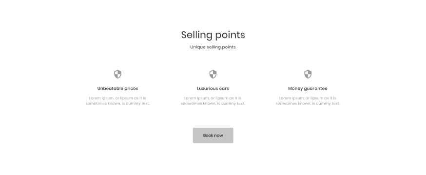
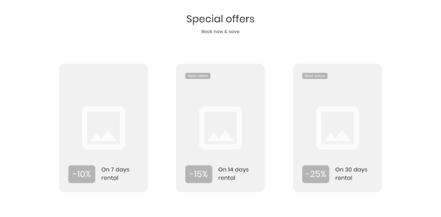
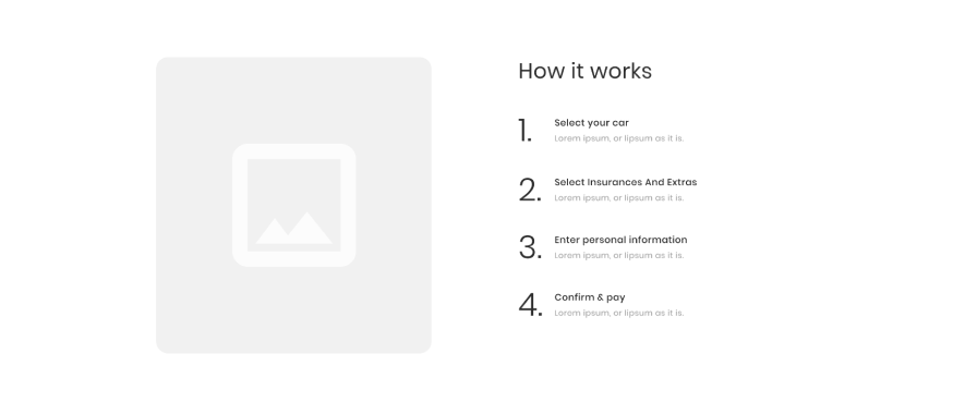
Wireframes
Wireframing served as a mockup technique for modeling the site and arranging the objects to achieve best user experience without missing important information.




Logo & colors
The blend of green/black colors have been chosen for both, the logo and the majority of graphical interface of the website.
Primary
Secondary

Hefja verkefni
Hafðu samband
